Choosing the right colors for a calm interior is one of the most important steps in shaping how a home feels. Color affects mood, energy, focus, and comfort in ways that people often notice without fully understanding why. A calm interior does not mean boring or plain. It means balanced, restful, and welcoming. With thoughtful color choices, any space can feel more peaceful and supportive of daily life.
How Color Influences Mood
Colors speak to the brain before furniture, layout, or decor get a chance to. Some colors slow the heart rate and relax the eyes, while others increase alertness and movement. In a calm interior, the goal is to reduce visual stress and create a sense of ease.
Soft, muted colors tend to feel calmer than bright or highly saturated ones. This is because the eye does not have to work as hard to process them. Calm colors often appear in nature, such as sand, stone, fog, leaves, and sky. These familiar tones help the brain relax and feel safe.
Color also interacts with memory and personal experience. A shade that feels calming to one person may feel dull or sad to another. This is why understanding basic color behavior is helpful, but personal preference should always be part of the decision.
Understanding Color Temperature
One of the first steps in choosing calming colors is understanding temperature. Colors are usually described as warm, cool, or neutral. Each group affects mood in different ways.
Cool Colors
Cool colors include blues, greens, and some purples. These colors often feel peaceful, airy, and soothing. They are linked to water, sky, and plants, which helps explain why they work well in calm interiors.
Soft blue can lower stress and promote focus. Gentle green often feels balanced and refreshing. Pale lavender can feel calm when it leans more gray than purple. Cool colors are especially helpful in rooms where rest and quiet are important.
Warm Colors
Warm colors include reds, oranges, yellows, and warm browns. In their brightest forms, these colors can feel energetic and stimulating. For a calm interior, warm colors work best when they are muted, softened, or mixed with neutral tones.
Warm beige, soft clay, light peach, and dusty terracotta can feel comforting without being overwhelming. These colors can make a space feel cozy and welcoming, which is another kind of calm.
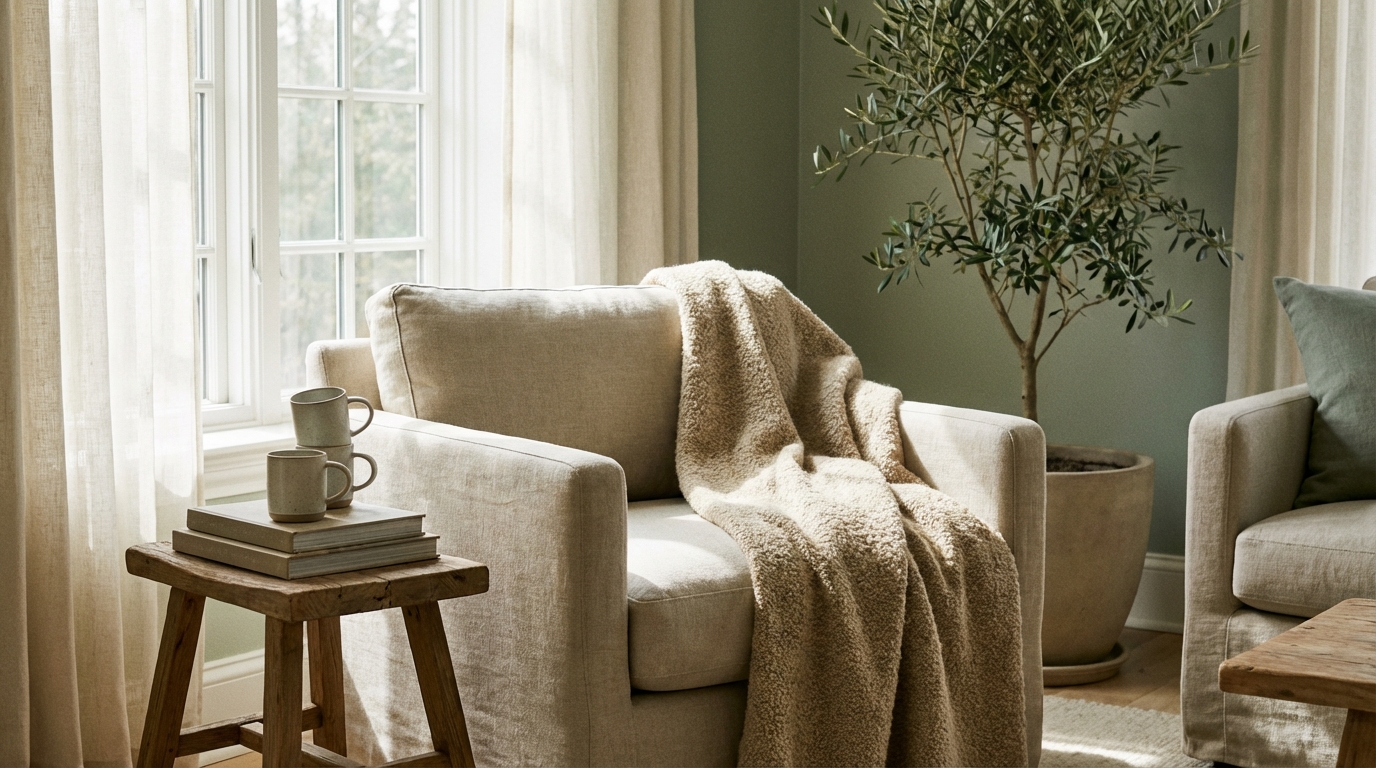
Neutral Colors
Neutrals include whites, grays, beiges, and taupes. These colors are often the foundation of a calm interior. Neutrals help reduce visual noise and allow the eye to rest.
Not all neutrals feel calm, though. Bright white can feel sharp or cold, while dark gray can feel heavy. The most calming neutrals usually have soft undertones and medium lightness.
The Importance of Undertones
Undertones are the subtle colors beneath the surface of a paint color. They play a big role in how a color feels once it is on the wall. Two colors may look similar on a paint chip but feel very different in a room.
A gray with blue undertones will feel cooler and calmer than a gray with green or purple undertones. A beige with pink undertones can feel warm and gentle, while a beige with yellow undertones may feel brighter and more active.
Understanding undertones helps avoid colors that feel off or uncomfortable once applied. For a calm interior, undertones that lean soft and natural usually work best.
Light and Its Effect on Color
Lighting changes how color looks and feels more than most people expect. Natural and artificial light can make the same color appear warm, cool, bright, or dull.
Natural Light
Rooms with a lot of natural light can handle cooler and darker colors without feeling heavy. Sunlight brings out clarity and depth, which can enhance calming shades like blue-gray or soft sage.
Rooms with limited natural light benefit from lighter colors that reflect light. Soft whites, pale neutrals, and light pastels help keep these spaces from feeling closed in or gloomy.
Artificial Light
Warm light bulbs bring out yellow and red undertones. Cool light bulbs highlight blue and green undertones. Choosing the right bulb temperature helps support a calm color palette.
For a calming effect, warm or neutral white lighting is usually better than harsh, cool lighting. The light should feel gentle and even rather than sharp or glaring.
Choosing Calm Colors for Different Rooms
Each room has a different purpose, and color choices should support how the space is used. Calm does not mean the same thing in every room.
Living Room
The living room is often a shared space for relaxing, talking, and spending time together. Calm colors here should feel welcoming and flexible.
Soft neutrals like warm gray, beige, or greige create a comfortable base. These colors allow furniture and decor to stand out without overwhelming the space. Muted blues and greens also work well, especially when balanced with warm wood or soft textiles.
A calm living room often uses one main color with subtle variation. Too many strong contrasts can break the sense of ease.
Bedroom
The bedroom is one of the most important rooms for calm. Color here should support rest, sleep, and relaxation.
Cool colors are especially effective in bedrooms. Soft blue, pale green, light gray, and lavender-gray help lower visual tension. Warm neutrals can also work if they are gentle and not too yellow.
Dark colors can be calming in bedrooms when used carefully. Deep navy, charcoal, or forest green can feel cocooning and restful when paired with soft lighting and light bedding.
Bathroom
Bathrooms are often small, so color choice matters. Calm bathroom colors should feel clean and soothing.
Light blues, soft greens, and pale grays are popular for a reason. They suggest water and cleanliness while remaining gentle on the eyes. Warm whites and light stone colors can also create a spa-like feeling.
Using the same color on walls and trim can reduce contrast and make the space feel calmer and more open.
Kitchen
Kitchens are active spaces, but they can still feel calm with the right colors. The goal is to balance energy and comfort.
Soft whites, light grays, and warm beiges help kitchens feel bright without being harsh. Muted green or blue cabinets can add calm character without overpowering the room.
Highly saturated reds and yellows are best avoided in calm kitchens, as they can feel busy and overstimulating.
Home Office
A calm home office supports focus and reduces stress. Color should help concentration without feeling dull.
Soft green is a strong choice because it balances calm and alertness. Blue-gray also works well, especially in rooms with good lighting. Neutral backgrounds with gentle color accents help keep the space grounded.
Avoid very dark or very bright colors that can cause eye strain during long work sessions.
Using Color Combinations for Calm
A calm interior usually relies on a limited color palette. Too many colors competing for attention can create visual noise.
Using shades from the same color family creates harmony. For example, combining light blue walls with deeper blue accents feels more restful than mixing unrelated colors.
Neutral colors help bridge different shades and prevent the space from feeling busy. A common approach is to use one main color, one secondary color, and one or two subtle accents.
- Pair cool colors with warm neutrals to create balance
- Use darker shades at ground level and lighter shades above
- Repeat the same colors in small ways throughout the room
The Role of Texture and Materials
Color does not exist on its own. Texture and material change how color feels in a space.
Matte finishes tend to feel softer and calmer than glossy ones. A matte wall absorbs light and reduces glare, which is easier on the eyes.
Natural materials like wood, linen, cotton, wool, and stone support calm color palettes. They add warmth and depth without needing strong color contrast.
Even within the same color, texture creates interest without adding visual stress. A room with layered textures often feels calmer than a room relying only on bold color.
Paint Finishes and Their Impact
The finish of paint affects how color is seen and felt. For calm interiors, the finish should support softness and ease.
Flat and matte finishes hide imperfections and reduce reflection. They work well in bedrooms and living rooms where calm is important.
Eggshell and satin finishes offer a slight sheen and are easier to clean. They can still feel calm when the color is soft and muted.
High-gloss finishes reflect a lot of light and draw attention. These finishes are usually better for trim or small accents rather than large wall areas in calm spaces.
Common Color Mistakes That Disrupt Calm
Even with good intentions, some color choices can work against a calm interior.
Using colors that are too bright or saturated is a common issue. These colors demand attention and can feel tiring over time.
Too much contrast between walls, trim, and furniture can break the flow of a room. Sharp contrast pulls the eye from one area to another instead of allowing it to rest.
Ignoring lighting often leads to disappointment. A color that looks calm in the store may feel harsh at home under different lighting conditions.
- Choosing pure white without considering warmth or softness
- Mixing too many undertones in one space
- Following trends without considering personal comfort
Testing Colors Before Committing
Testing is one of the most important steps in choosing calm colors. Paint chips alone are not enough.
Large sample boards or painted sections on the wall show how color looks at different times of day. Morning, afternoon, and evening light can change color dramatically.
Testing colors next to furniture, flooring, and fabrics helps ensure harmony. A calm color should feel comfortable alongside everything else in the room.
Living with a sample for a few days allows the initial excitement or doubt to settle. Calm colors often grow more pleasing over time.
Using Accent Colors Without Losing Calm
Accent colors add personality, but they should be used carefully in calm interiors.
Soft accents work better than bold ones. Muted blues, greens, blush tones, and warm browns can add interest without overpowering the space.
Accents can appear in pillows, throws, artwork, or plants. This keeps them easy to change if the space starts to feel too busy.
Repeating accent colors in small amounts helps maintain balance. A calm interior feels intentional rather than scattered.
Color Flow Between Rooms
In homes with open layouts or connected rooms, color flow is important for calm.
Using related colors throughout the home creates a sense of continuity. This does not mean every room must be the same color, but they should feel like they belong together.
Transitions are smoother when colors share similar undertones or intensity. A soft shift from one shade to another feels calmer than a sudden change.
Hallways and entryways often work best with light, neutral colors that connect surrounding rooms.
Maintaining a Calm Color Palette Over Time
As styles and preferences change, a calm color palette offers flexibility. Neutral and muted colors adapt well to new furniture, art, and accessories.
Refreshing a calm interior does not require repainting everything. Small updates, such as new textiles or decor, can renew the space without disrupting its peaceful feeling.
Regular cleaning and good lighting help colors stay true and pleasant. Dust and poor lighting can make even the best colors feel dull or heavy.
Calm interiors support daily life best when they reflect both thoughtful color choices and the people who live there.